Synopsis
TrendHub Next Generation
We are proud to announce the full launch of the next-generation TrendHub (advanced) trend viewer & industrial analytics Hub for timeseries sensor data. Based on your extensive feedback, we’ve drastically improved the user experience such that even more than today, TrendHub will empower operators, engineers and other domain experts.
With TrendHub Next Generation we implemented more than 600 feature ideas we received from our customers. Seeing the many improvements, it is impossible to list them all. You will discover small improvements daily! With TrendHub Next Generation we implemented more than 600 feature ideas we received from our customers. Seeing the many improvements, it is impossible to list them all. You will discover small improvements daily!
To kickstart your TrendHub Next Generation journey, there are multiple resources at your disposal: To kickstart your TrendHub Next Generation journey, there are multiple resources at your disposal:
Check the sections below to get an overview of the main highlights.
Follow our new 20-minute eLearning course to get introduced to TrendMiner Next Generation (ideal for users transitioning to TrendHub Next generation).
Follow our brand new TrendHub Basic eLearning for more details (ideal for new and recent TrendMiner users).
Visit the brand new getting-started guide where you can follow in-app tours on request.
Improved trend viewer
We drastically improved our trend viewer to make it even more user-friendly, giving users the full flexibility and agility to visually explore sensor data. Some examples include simplified grouping & auto-scaling of multiple tags, scrolling & panning of axis, more detailed scatterplots colored by time, etc.
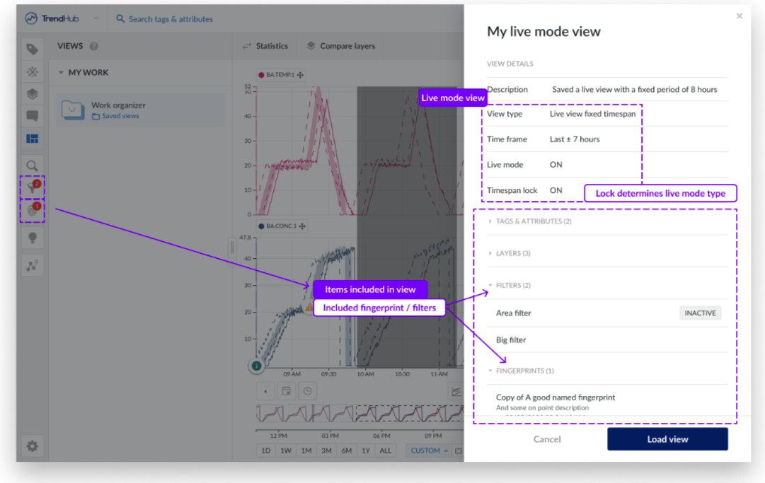
Views play a central role in TrendHub Next Generation. The current view is always indicated at the top of your screen and view actions are easily accessible. The complete configuration of your view will be stored when saving a view, including the visualization mode, live button, active filters, fingerprints and chart settings.
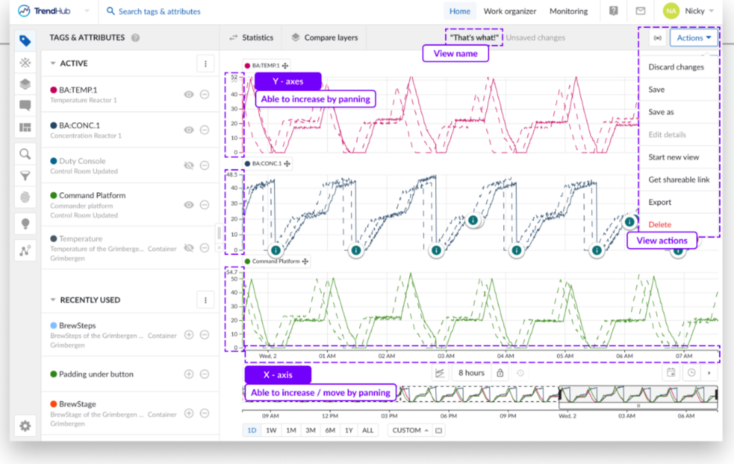
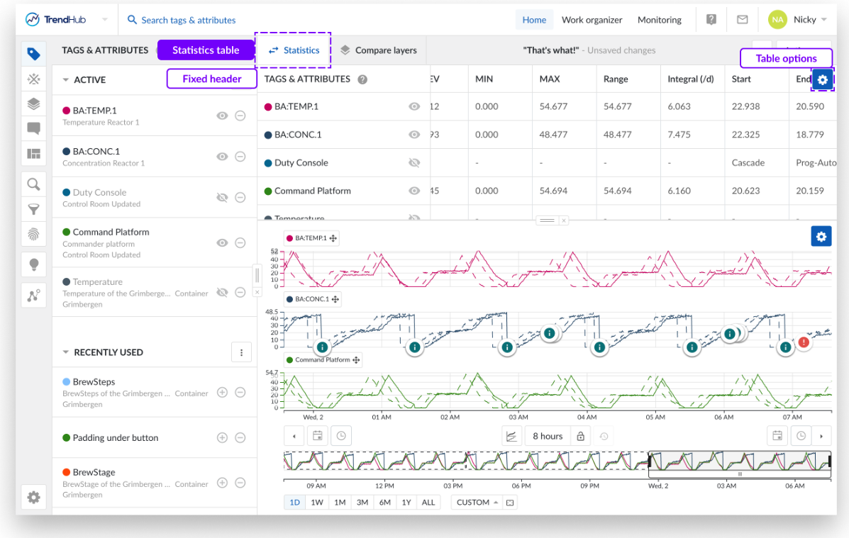
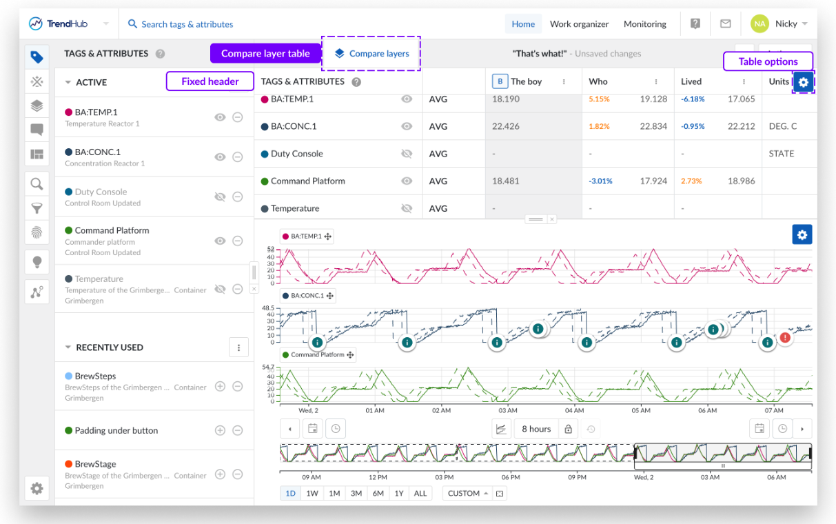
Descriptive statistics for the base period (Statistics) and all other layers (Compare layers) are easily accessible and can be displayed together with time series data.
TrendHub Next Generation improvements based on early user feedback
With the Beta version of TrendHub Next Generation, a lot of the trend viewer improvements were already available. Initial feedback has already been taken into account and the following additional improvements can be observed:
Fixed headers: Headers of the compare layer and statistics table are now sticky and will always be visible when scrolling through the table.
The shift buttons have been improved to easily apply a sequence of shifts.
The export functionality received multiple improvements.
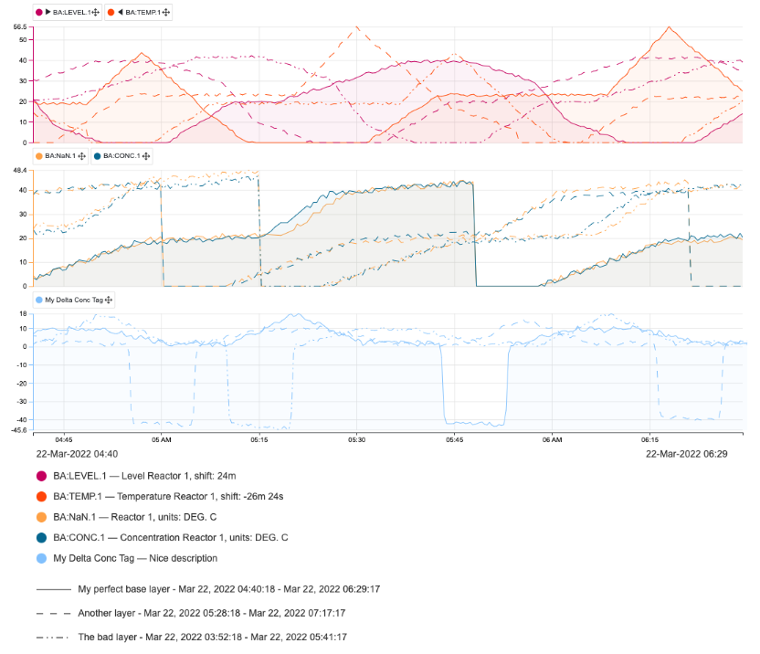
The chart visual export contains more details, now including component descriptions, units of measurement, and shift values. Also, the layer name is included in the export.
It is now possible to export a single scatter plot or even a histogram. Just select the specific histogram or single scatter plot before starting a chart (visual) export.
A colored points option has been added to the scatter plot configurations. Once the option is enabled, the points on the scatter plot will have a color grade from oldest (in blue) to newest (in orange) values.
The interpolation type option for IP21 tags is added.
Added filters and their states (enabled/ disabled) are now saveable as part of the view.
Added filters and their states (enabled/ disabled) are now saveable as part of the view. In predictive mode you can now zoom in and out using your mouse wheel without disabling predictive mode. Note: Predictive mode stays enabled if future timestamps are visualized.
A scatter plot can now be saved on the desired level of interest in your view.
Off-the-chart values are now also displayed on data scooters.
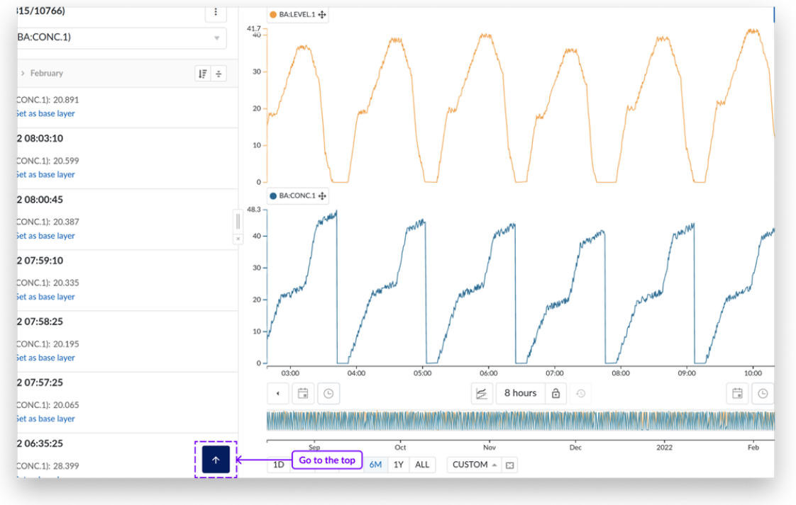
Panning option has been added to all axes in TrendHub (focus chart and context chart).
Panning is an option to move the charts axes without the need of using the time pickers or shift buttons.
Depending on the state of the lock button you can either move your current period (locked state) or increase the current period (open state).Depending on the state of the lock button you can either move your current period (locked state) or increase the current period (open state).
The Y values can also be increased.
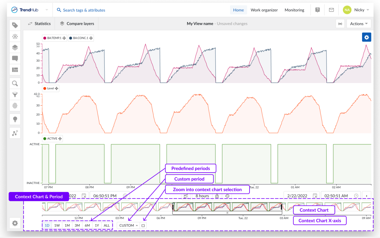
The context chart area has received a major update:
The "Double slider" has been replaced by predefined periods, drastically simplifying the search scope selection.
A custom context chart period can also be set instead of the predefined periods using the custom option.
Next to the custom period option there is an option to use the visualized period of focus chart as context period.
Streamlined search experience
Both the workflow of performing searches and the user experience when working with the search results have been improved. Both the workflow of performing searches and the user experience when working with the search results have been improved.
The workflow of the searches has been unified, to provide the same experience, whether you start a new search or start from a saved search. There are now only 2 main screens:The workflow of the searches has been unified, to provide the same experience, whether you start a new search or start from a saved search. There are now only 2 main screens:
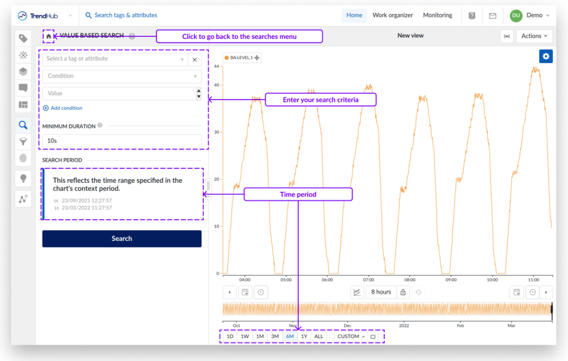
The set search setup screen to specify the search conditions.
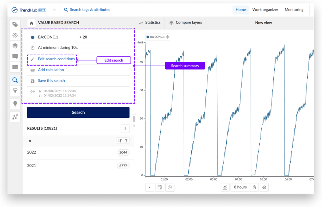
The search detail screen providing a summarized overview of the search conditions.
When opening a saved search, you are immediately directed to the search detail screen, where you can choose to perform the search or edit the conditions. The search detail screen is a static representation of the currently active search. Any changes to the chart (which is important for the similarity search and area search), are only considered when explicitly editing the search.
At any time, the period for which the search will be performed (selected via the context chart), will be indicated in the search overview as well.
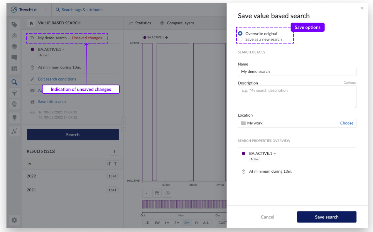
Similar to the views, modifications to the conditions will be indicated as "unsaved changes" and the user can decide to save the search as a new search or to overwrite the current search. This allows users to easily apply an analysis on similar assets.
Multiple calculations
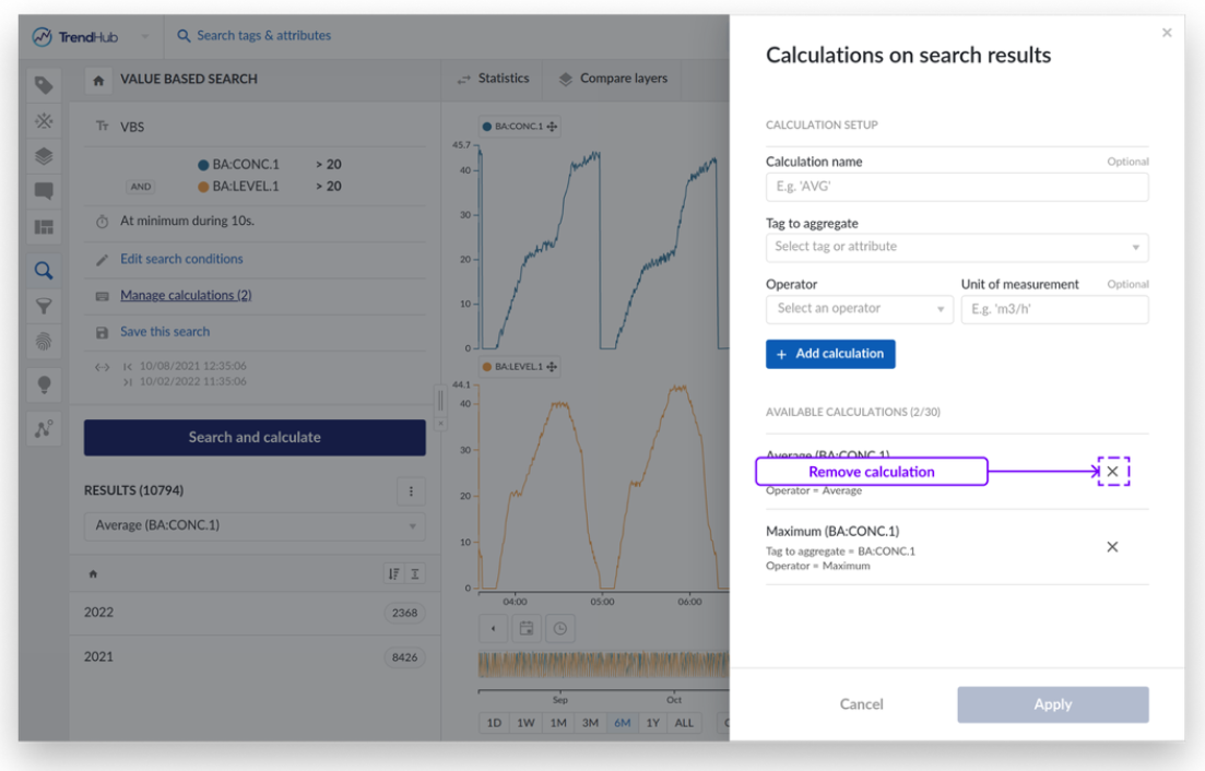
Being able to perform and export multiple calculations on top of search results has probably been the most requested feature. With the introduction of TrendHub Next Generation, this feature is now available and can be found as an action on the search detail pane. Being able to perform and export multiple calculations on top of search results has probably been the most requested feature. With the introduction of TrendHub Next Generation, this feature is now available and can be found as an action on the search detail pane.
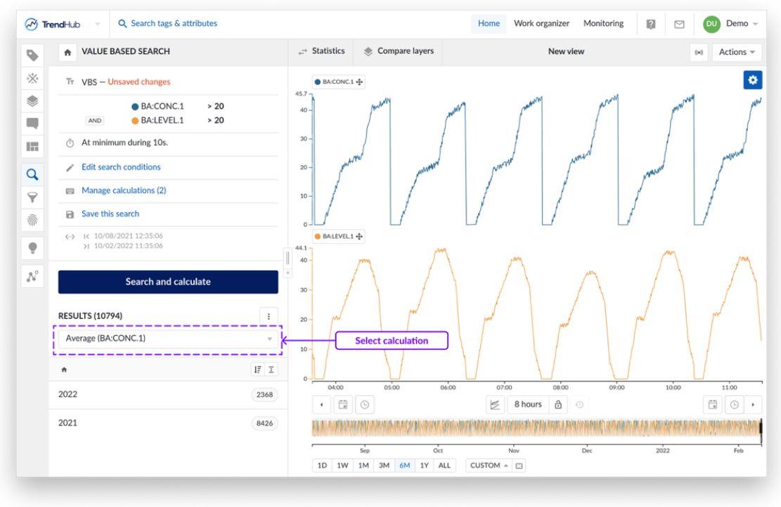
Up until 30 calculations can be added at once. In the search result list, one specific calculation can be selected which will be visualized on top of the results and will be used when sorting on calculations. As a bonus, the calculation definitions will be saved as part of the search, once again simplifying the reproduction of your analysis. Once calculation definitions are available, the calculations will be executed when performing the search.
Result list improvements
Working with the search results is now much easier and there are multiple improvements included in this release.
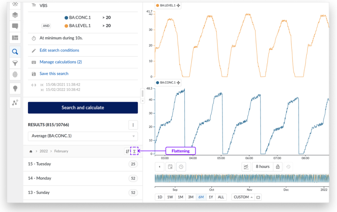
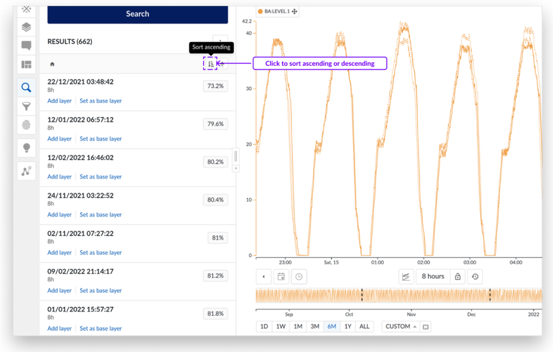
The user can switch between showing the results in bins (default option) or to show them as a flat list. Click on the flattening button to display the results in a scrollable list. When scrolling down, the user can easily jump back to the top of the list by clicking on the blue arrow displayed on the list.
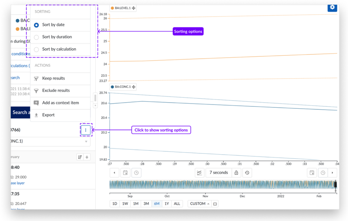
With the introduction of the sorting button, the user can sort ascending or descending the results of the current bin he is working on. By default, the results are displayed descending and in date bins, except for similarity search, where the results are sorted descending by score.
To switch the sorting mode of the bins (date, duration, calculation, or score), the user can select the mode in the search results menu.
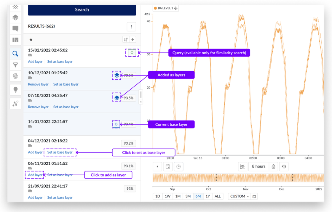
Adding the results as layers is simpler and clearer than before. The user can add layers by clicking the link under the search result or set it as a base layer. When the user adds a result as layer, it will be displayed with the layer icon and indicated in a blue color. The base layer will be indicated with a “B” (base). For similarity searches, the user can now identify the search result that matches the query with the “Q” (query) icon indicated on the search result. This enables the inclusion of the query period in filters, exports, and calculations.
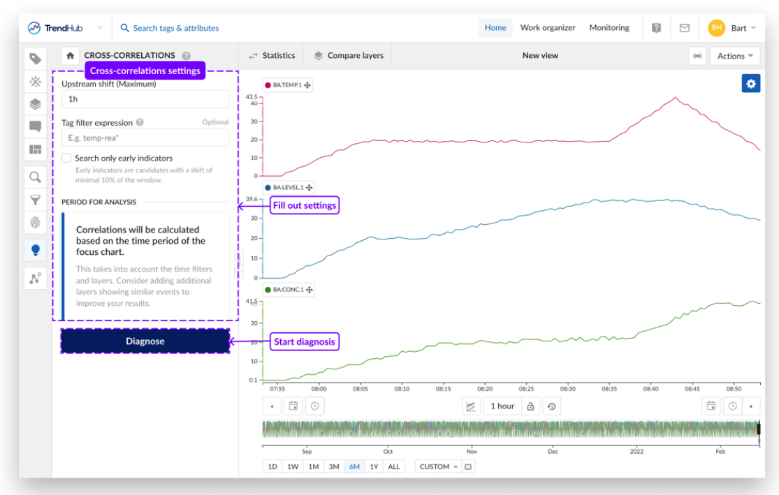
Diagnose to replace recommender engine
The Recommender Engine is now replaced by the Diagnose menu to facilitate global Root Cause Analysis. The diagnose functionality can now be found in the left-side menu as any other functionality and no longer in the top menu bar. Additional general improvements include the following:
A clear distinction is made between the cross-correlation analysis and the fingerprint deviation analysis for a better discovery of both functionalities.
All settings can be adjusted before the analysis is started and a persisted result list is shown. This allows users to visually validate candidates without losing the complete analysis. The overall flow is very similar to the search workflow.

As will be discussed in the following section, the influence factors functionality has been rebranded and moved to the tag builder menu, making Diagnose the go to menu for root cause analytics. The following improvements have therefore been added to the cross-correlation analysis.
An upstream shift detection can be specified up to 24 hours, instead of the default, fixed 1 hour.
The minimum and maximum time shift is shown in case multiple layers are used for the analysis.
Prediction Tags to replace Influence Factors
Prediction tag builder is replacing our influence factors functionality to facilitate soft-sensor creation. The predictive tags allow you to create a multi-variable, linear model to predict the value of interest from any other available data.
The creation of these tags is made more user-friendly by introducing a completely new workflow which guides you to the final model in different steps. When initiating the workflow, a dedicated chart is visualized on which the model will be visualized.
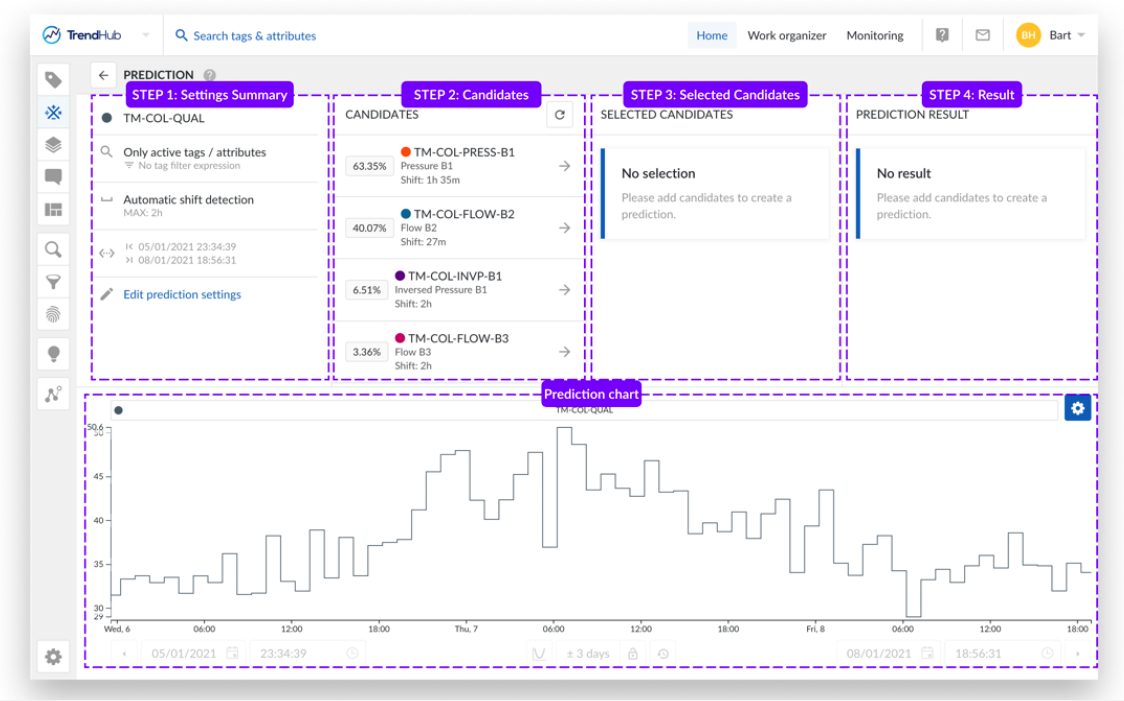
Next to the change in workflow, the following improvements have been implemented:
Listed candidates are no longer returned in bins but in one list to have a better overview of all your results without opening/closing all those bins.
Tag/Attribute description are now included for the listed candidates to better understand which candidate is listed.
The resulting model, including the complete workflow settings is now saved as a new tag builder type, i.e. prediction tags.
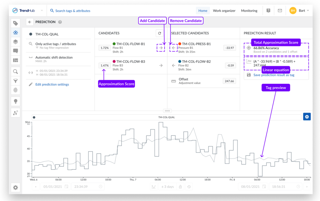
Results are persisted when switching menus and selected candidates are persisted when changing the search scope. This enables more flexibility to evaluate different selection of tags and time shifts to be evaluated during the setup of your model.
Improved in-app learning & support experience
To accommodate the change in user experience, we are launching an improved in-app learning & support experience. All resources can now be found in the top bar, as well as the well-known options to reach out to the TrendMiner team.
The help center will take you to the TrendHub Next Generation documentation, while clicking E-Learning courses will direct you to our online learning platform. The help center will take you to the TrendHub Next Generation documentation, while clicking E-Learning courses will direct you to our online learning platform.
A brand new getting-started guide is now included which allows users to access in-app tours at their own pace.
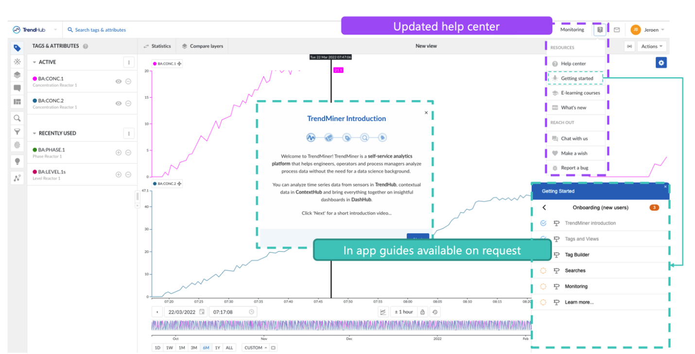
Note
Data gathering needs to be enabled to be able to use the getting-started guide.
A seamless integrated platform experience
Unified Monitoring Center
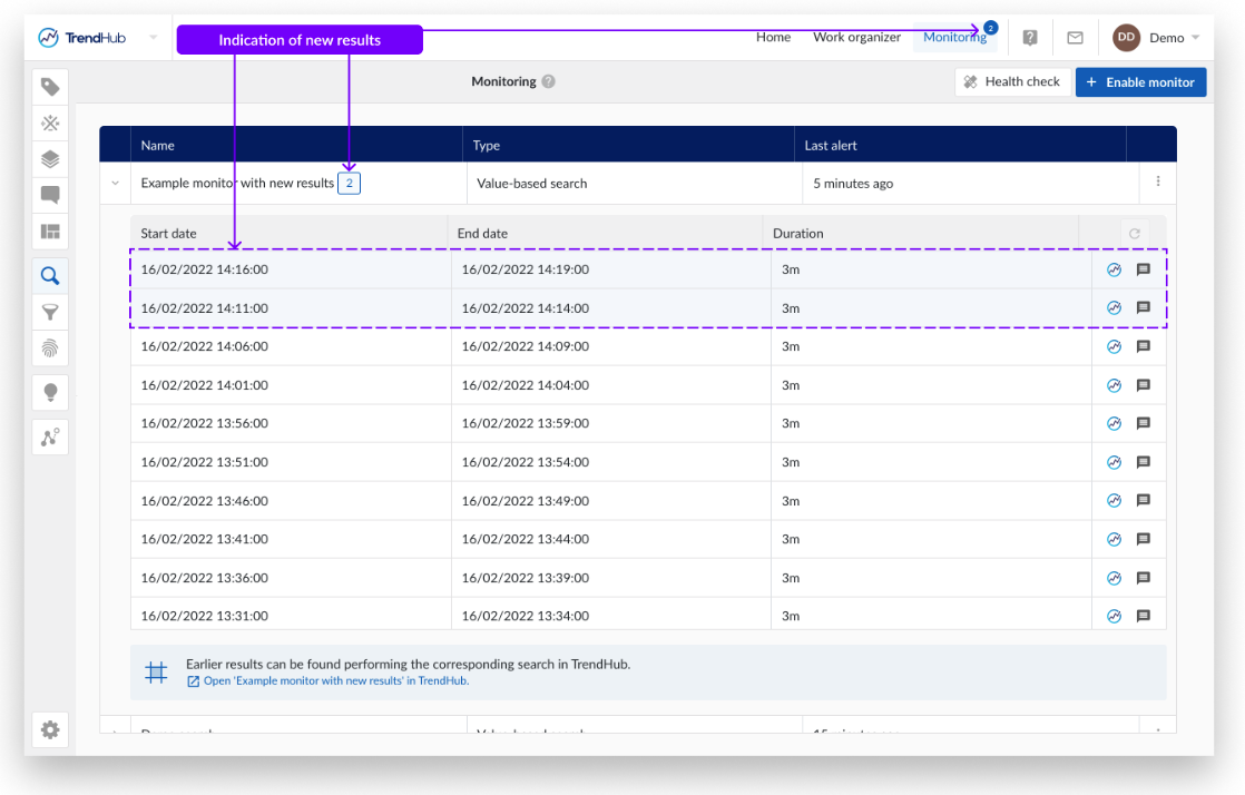
The TrendHub Inbox and monitor configuration menu has been replaced by the monitoring center, which can now be found in the top menu bar, next to the Work Organizer.

The monitoring tab is accessible in all hubs. When opening the monitor tab, you will be presented with a full screen table containing all enabled monitors. The main advantages of the unified monitoring center are the following: The monitoring tab is accessible in all hubs. When opening the monitor tab, you will be presented with a full screen table containing all enabled monitors. The main advantages of the unified monitoring center are the following:
Accessible in all hubs.
A nicely organized table overview of only the enabled monitors, which can be sorted on Name, Type and timestamp of the last result.
A persisted list of the 50 most recent monitor results for each monitor. Results will always be shown in this table, even if no actions are enabled.
Clear indication of unseen results.Clear indication of unseen results.
Click through available to the original search or fingerprint, in case the conditions of the underlying item need to be modified.
Monitoring email
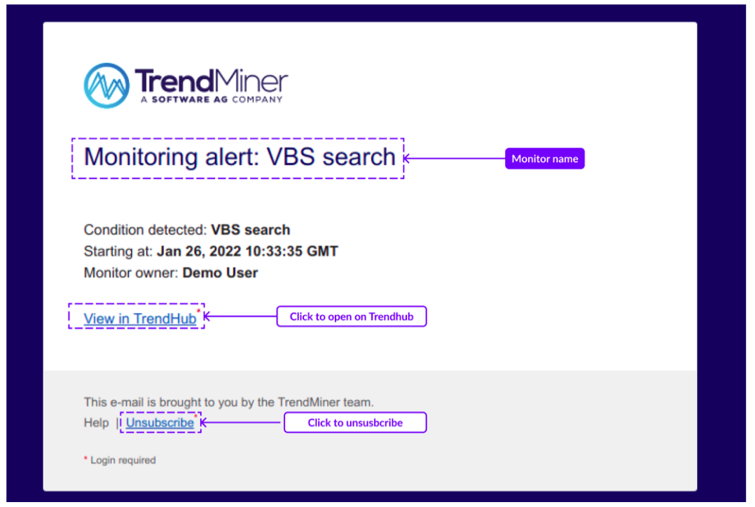
The monitoring email that is send out whenever a new monitor result is detected has been updated. These mails contain the same information as before, with the following 2 additions:The monitoring email that is send out whenever a new monitor result is detected has been updated. These mails contain the same information as before, with the following 2 additions:
An “Unsubscribe” link to remove yourself from the distribution list of this specific monitor. Unsubscribing only works for TrendMiner Users and if their e-mail address was mentioned explicitly. Unsubscribing is not possible if a group email was used.
Indication of the owner of the monitor.
ContextHub visualizations in DashHub
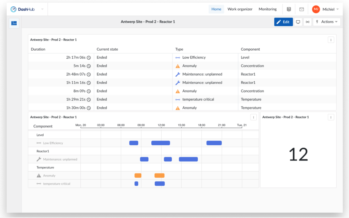
In order to ensure that all ContextHub visualization modes are also supported in DashHub, the ContextHub view count tile has been renamed to ContextHub view tile. The tile now enables users to visualize context data based on a saved context view in different display modes. After selecting this type of tile in the "Create new tile" side panel and specifying the desired context view, a display mode can be chosen. There are three different display modes, each with their specific purpose:
Count - The display mode "count" simply displays the number of context items within a certain context view in a clear way. This could for be used, for example, to monitor event types that represent critical issues, or keep track of the amount of batches produced by a production line over a given time period.
Table - The "table" display mode allows you to directly embed a ContextHub table into DashHub. The table configuration (columns, sorting, etc.) is directly inherited from the corresponding context view. You can interact directly with context items in the table, as clicking on any row in the table will open the context item detail panel.
Gantt - Similar to the "table" display mode, the "Gantt" display mode will directly embed a ContextHub Gantt chart into DashHub. The Gantt configuration (timeframe, pinned rows, etc.) is directly inherited from the corresponding context view. You can interact directly with the context items on the chart, as clicking on any item will open the context item detail panel.
Note
Some display modes are only available if the selected view meets certain criteria. The "Gantt" display mode is only available if the selected view contains a component filter. Some display modes are only available if the selected view meets certain criteria. The "Gantt" display mode is only available if the selected view contains a component filter.
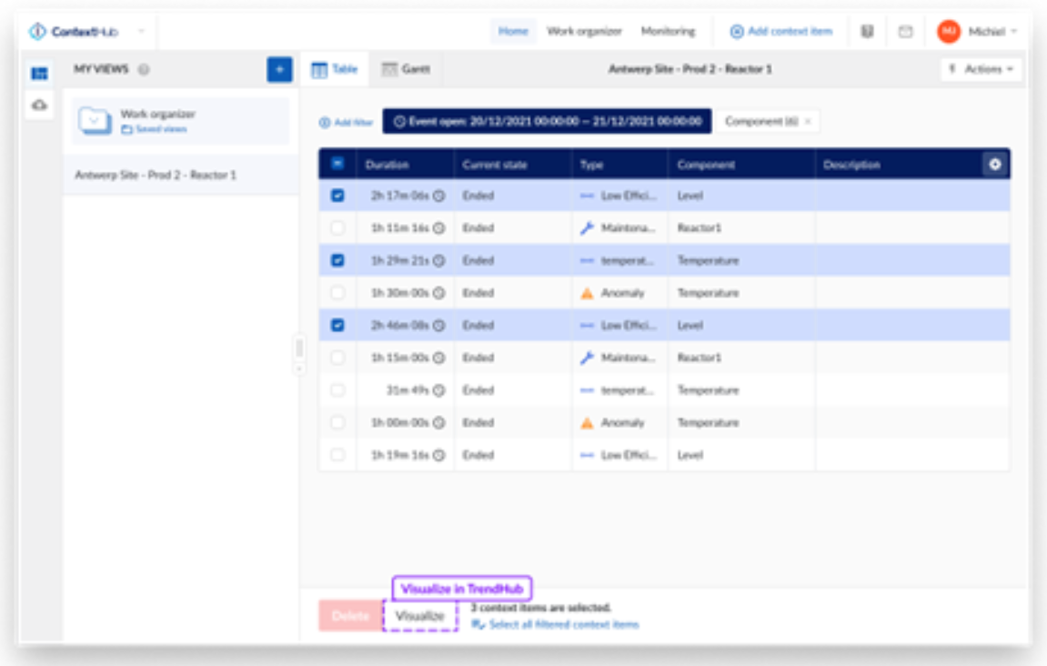
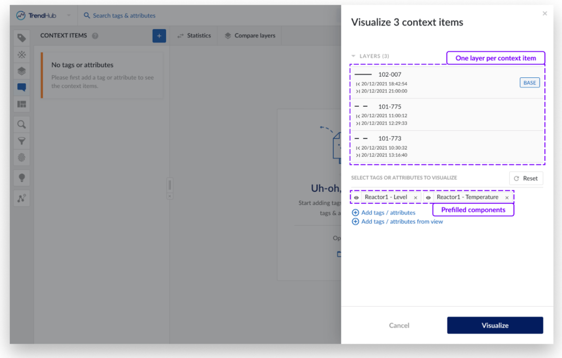
Visualizing multiple context items at once in TrendHub
It’s now possible to easily compare and analyse timeseries data related to context items in TrendHub, thanks to the new bulk visualization option. Making a selection of context items in the context item grid in ContextHub will now give you a “visualize” option in the footer menu, which will open up TrendHub and create a layer for each context item selected. For the context items that are related to attributes, the corresponding tags will be pre-selected, but it’s possible to modify this selection at will.
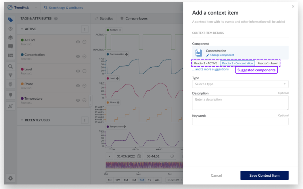
Component suggestions during context item creation
With component suggestions, selecting the right component to new context items during context item creation has become quicker and easier, from both ContextHub and TrendHub.
ContextHub - The application will keep track of recently used components during context item creation and display them as suggestions when creating additional context items. If the user has a specific view open, the list of recently used components is filtered based on the components present in the view.
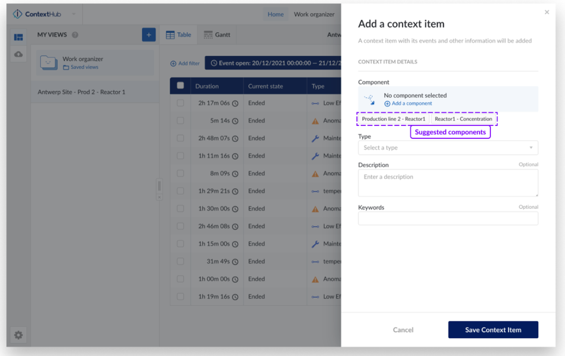
TrendHub - In TrendHub, suggested components for context item creation are generated based on the visible active tags in the view the user currently has open. Additionally, when the context item is created from a stacked view, or a view with only a single visible tag, the tag over which the user was hovering when choosing to create a context item will be automatically pre-selected.
Additional New features
Improved sorting on the Context item grid
To make it easier to gather insights from context data, sorting is now supported on all columns on the context item grid, except for the component column. This includes columns for custom context fields of all types (numerical, string and dropdown). Sorting can be applied in the same way as was the case for previously sortable columns, by clicking on the column header. Repeated clicks will alternate between ascending and descending sorting.
Improved manual and automatic resynchronisation of context data
Manual resynchronisation
Users can now manually resynchronize individual context items from the options menu on the context item detail panel. This can help bring outdated context items up to date, in situations where it might have gotten desynchronized from its source system. This option is only available for context items created through the context sync.
Administrators additionally have the possibility to resynchronize multiple context items at once, by selecting one or multiple context items in a table view and clicking the “Resync” button in the footer menu.
Automatic resynchronisation
Two automated clean-up processes for context items have been implemented.
After an asset sync or import - Upon the successful completion of an asset synchronisation or a CSV-based asset import, an automated clean-up job will attempt to resynchronise all context items in the system without reference to a component. This is to ensure that context items that should be related to new assets imported into TrendMiner as part of the recent AF sync or import, will be updated accordingly.
Nightly - Every night, the system will check for context items with a duration of longer than 24 hours, for which no “end” event has been received yet. These context items will be resynchronised automatically, to ensure that they are correctly updated in case the “end” event erroneously did not reach TrendMiner. ConfigHub administrators can also manually trigger this resynchronisation process on-demand from the data source panel in case immediate resynchronization of open items belonging to a specific data source is needed.
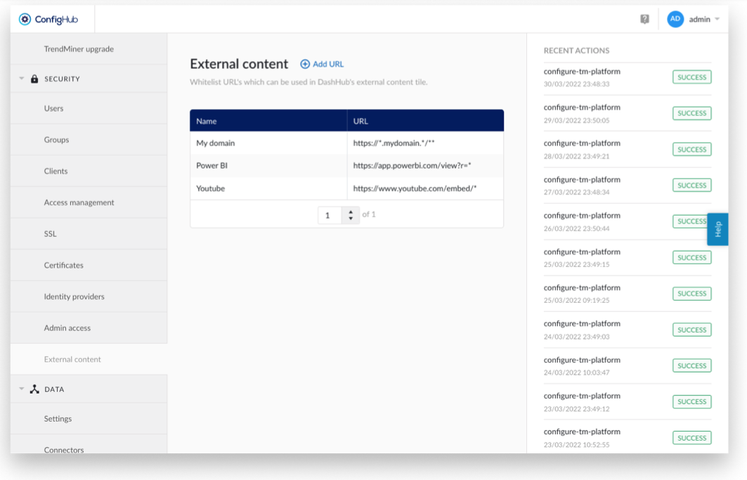
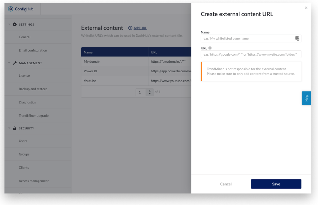
External content tile for DashHub
A new tile has been added to DashHub to support embedding images, videos or content from external tools/data such as PowerBI, Tableau, PI Vision, P&IDs, 3D CAD models, etc. into a dashboard.
In order to give system administrators strict control over which content is allowed to be embedded, a dedicated administration screen has been added to ConfigHub. On this screen, administrators will be able to specify domains from which external content is allowed.
Note
When specifying allowed domains, the use of wildcards makes it easy to allow entire domains or subdomains.
The use of “*” in a URL allows any variation of the same URL, without extending the path (so “www.mydomain.com/* will allow the use of “www.mydomain.com/extension1” in an external content tile, but not “www.mydomain.com/extension1/extension2”).
The use of “**” in a URL allows any variation of the same URL, even with path extensions (so “www.mydomain.com/**” would allow “www.mydomain.com/extension1/extension2/...” to be used in an external content tile).
TrendMiner on KubernetesTrendMiner on Kubernetes
Kubernetes is the de-facto standard for deploying and managing large scale distributed applications, like TrendMiner. Today, Kubernetes is supported by all major hyper scalers and lots of (large) software companies provide ecosystems and tooling around it. Kubernetes is already being used today to run Software AG cloud.
With this release, TrendMiner is now being deployed on Kubernetes. Note that Kubernetes comes in many flavours and forms, we categorize them as:
Edge: small (single node or a few servers) on premises deployments.
Self-managed: you can run your own Kubernetes platform (open source or enterprise/commercial like OpenShift). This can be on your own hardware or on a hyper scaler.
Managed: You leverage Kubernetes-as-a-service from your preferred hyper scaler
With this first release, we have replaced our appliance and single node deployments to run on an Edge variant of Kubernetes.
Over the coming releases, we will start expanding to Managed Kubernetes deployments (In a first stage our production SaaS customers, and later supporting scaled out cluster deployments on customer–owned cloud accounts).