Synopsis
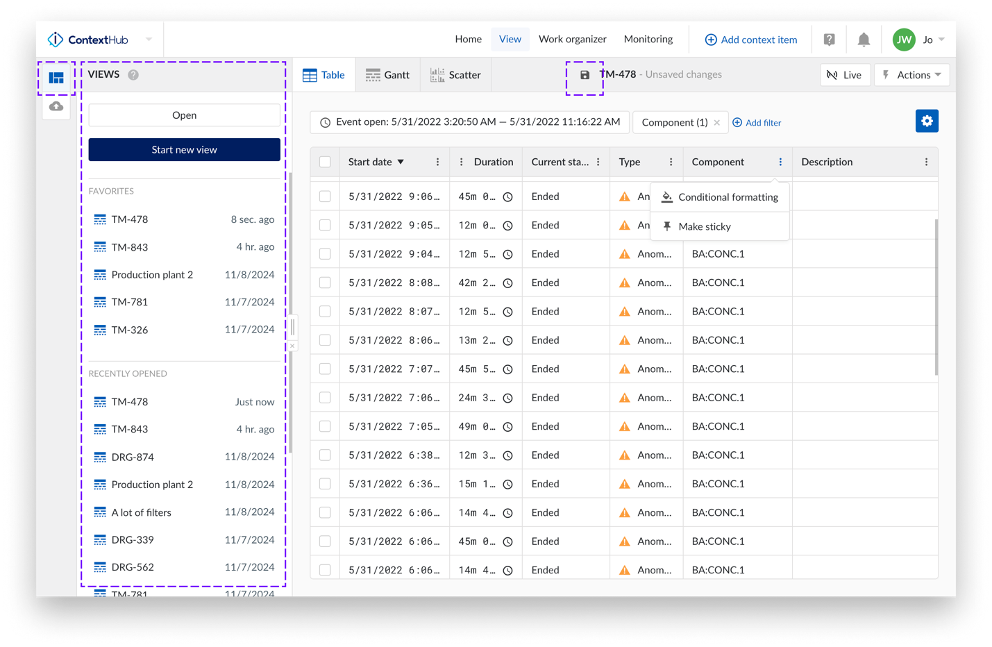
Table in Event Analytics
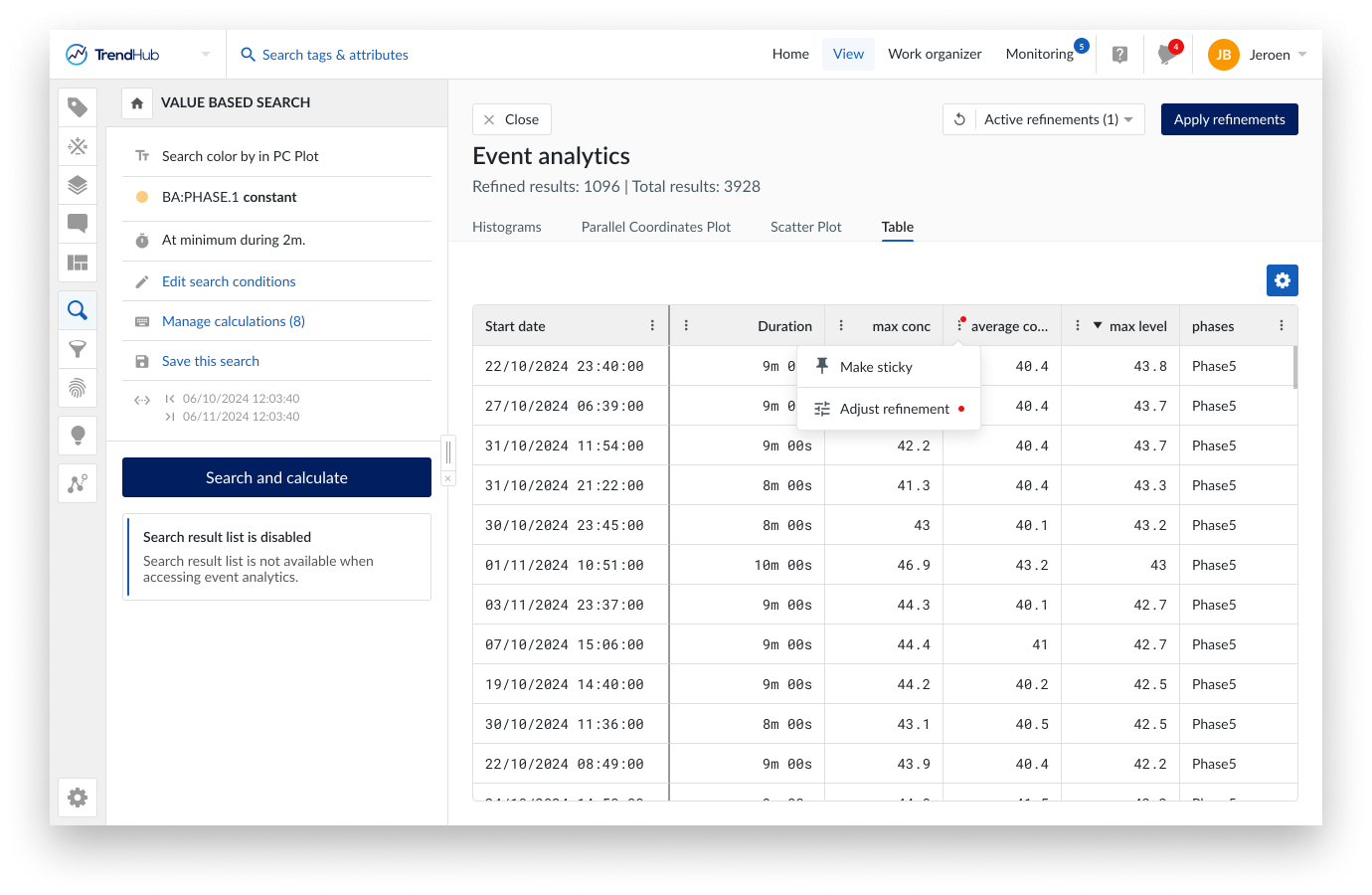
Event Analytics now include a table overview as a fourth visualization option, next to the already available histograms, parallel coordinates plot and scatter plots. The table overview provides a full visibility of all time aggregations and calculations on search results simultaneously, including calculations on digital or string tags.
Refinements can be applied directly from the table header and will be carried over to other tabs. Contrary to the other tabs, only the refined results will be shown in the table. To assess the impact of a refinement, the header has been extended to always show the total number of results before and after applying refinements.
Event Analytics extensions
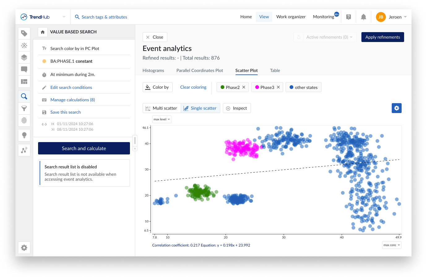
The dots in the scatter plots can now also be colored based on the value of a calculation on a digital or string tag. This will allow you to identify patterns based on, for example, different recipes or equipment used.
The color by option only needs to be specified ones and will then be active on both the scatter plot and the parallel coordinate plots. Changes made to the selected states on the scatter plot tab will automatically be reflected on the parallel coordinates plot and vice versa.
Both start date and end date have been added as additional property within Event Analytics. This opens different analysis flows like analyzing the “density” of search results on a time axis, as well as plotting the evolution of an aggregated value with respect to time by using the scatter plot visualization.
On every search, up till 35 calculations can be defined. To put emphasis on subset of these properties in any of the visualization, an option has been introduced to select which of the numeric properties should be shown.
Table redesign
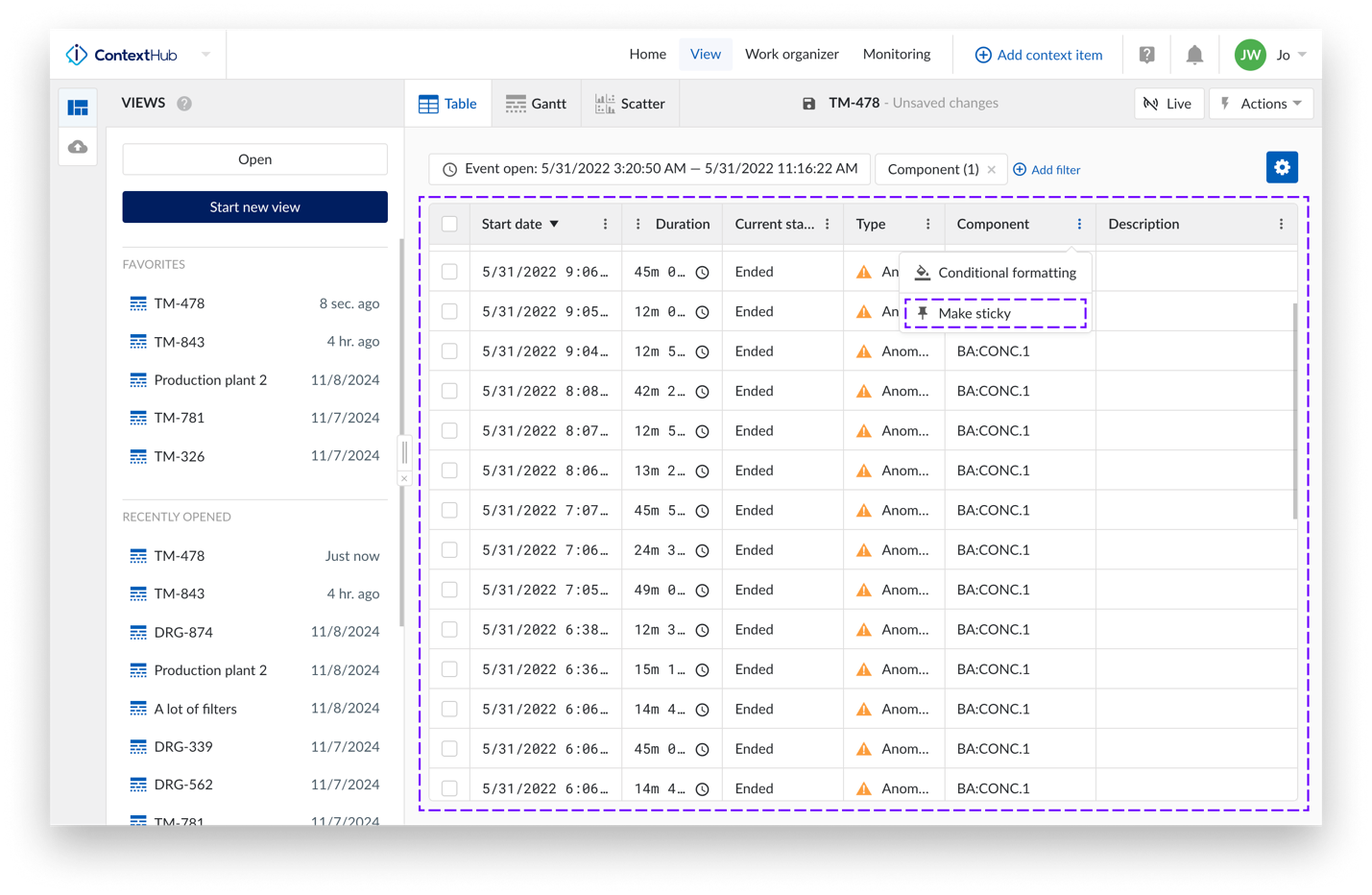
All tables across the platform have been redesigned for a cleaner, more functional user experience. Improved font, cell alignment, and enhanced hover states increase readability and clarity. Headers now have a neutral style for a streamlined look, and options are grouped for easier access. Users can adjust table density for optimal spacing and readability, and columns can be made sticky. This update aligns tables with best practices, creating a more consistent experience throughout the platform.
Aligned navigation across hubs
The left panel for opening or creating views in TrendHub and ContextHub has been aligned with DashHub, enhancing consistency across the platform. A favorites list has been added next to the recently opened list, providing quicker access to frequently used items. Additionally, the save icon is now available across hubs, located in the top bar next to the view title. These updates contribute to a more unified look and feel throughout TrendMiner.
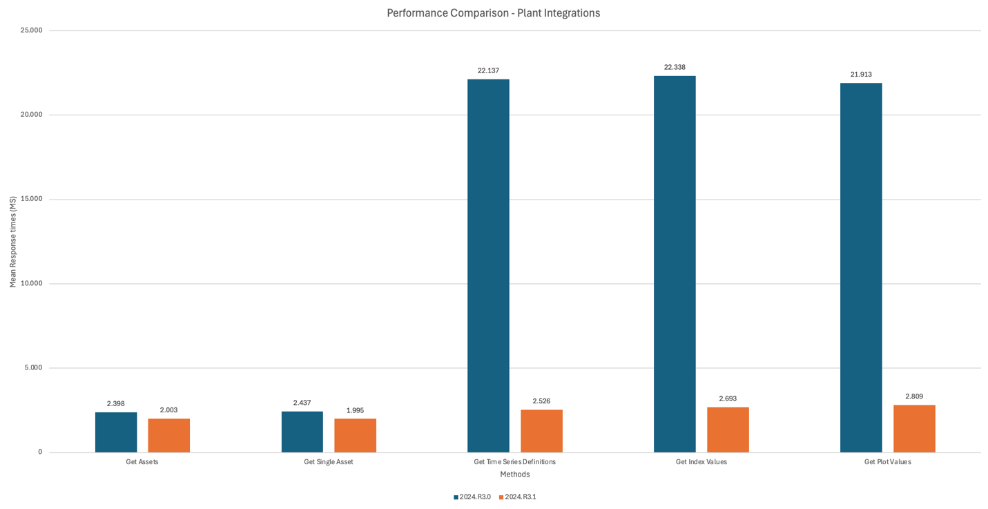
Enhanced Plant Integrations performance
We reworked Plant Integrations by adopting the Open Web Interface for .NET (OWIN), a modern communication framework. This upgrade delivers improved performance, greater flexibility, easier testing, and full compatibility with modern .NET frameworks, ensuring a more robust connection between TrendMiner and on-premise historians. Additionally, we streamlined connection metrics collection by optimizing how the connection metrics are written. Together, these enhancements resulted in significant improvements, achieving an 8x performance boost in Plant Integrations processing.
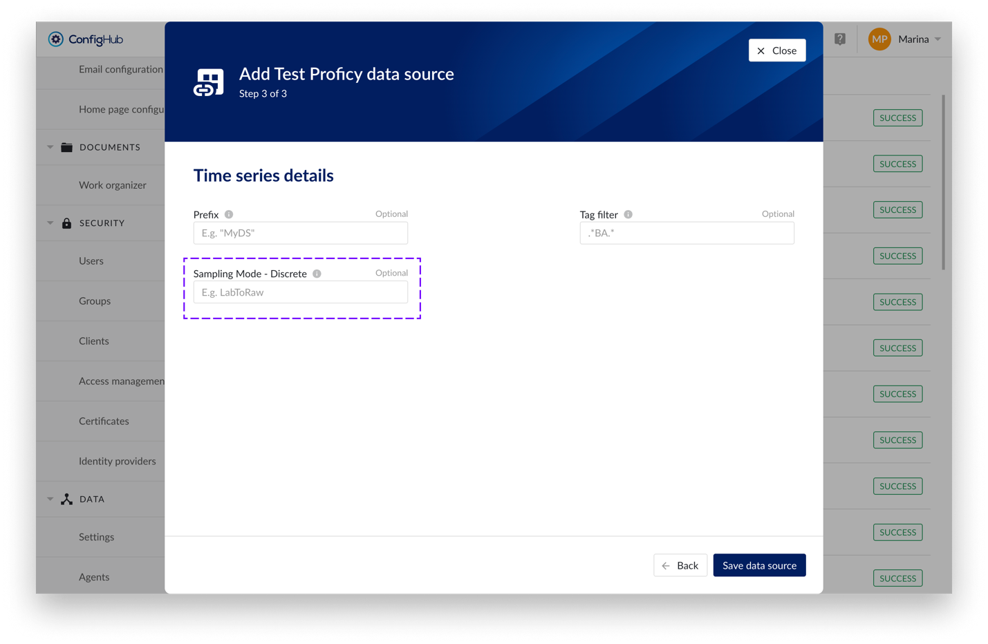
Override sampling mode for discrete tags in Proficy provider
In Proficy provider, introduced the ability to override sampling mode for discrete tags, allowing users greater flexibility to choose the appropriate mode for their analysis needs. The value is configurable via the "Sampling Mode - Discrete" property on the Time Series details screen in ConfigHub.