Synopsis
Chart alias customization
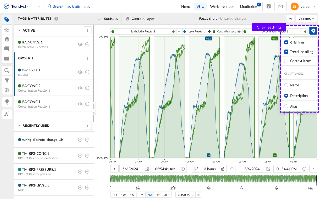
By popular request, it is now possible to specify a personal alias for every tag or attribute. You can set the personal alias in the tag details and it can be used as labels on the focus chart, statistics table, and compare table. In addition to the chart alias or tag name, you can also choose to use the tag or attribute description as a label on the focus chart within the focus chart settings.
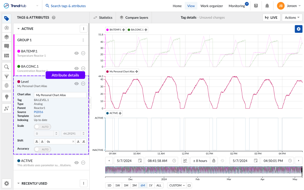
Company tag naming conventions often result in long, complex tag names. By providing a chart alias, it is easier to identify your tag of interest and more meaningful names can be used when sharing views with colleagues who are not familiar with historian tag names.
Scatterplot formatting by layer
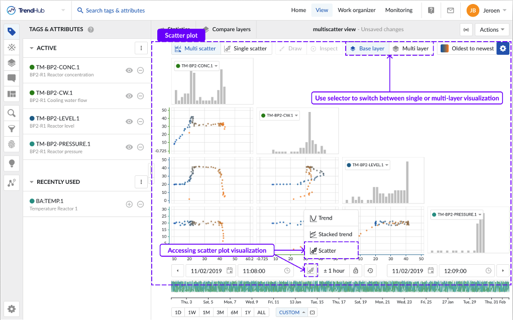
In earlier TrendMiner versions, scatterplots in TrendHub would only display the data of your base layer, even if additional layers had been added to the focus chart. In the newest release, scatterplots can be configured to display all visualized layers.
By default, the scatter plot will open as a multi-scatter visualization (i.e. multiple tags), showing only the base layer. You can switch to a multi-layer visualization using the top right navigation button.
In the multi-layer visualization, data points belonging to one layer will all have the same color.
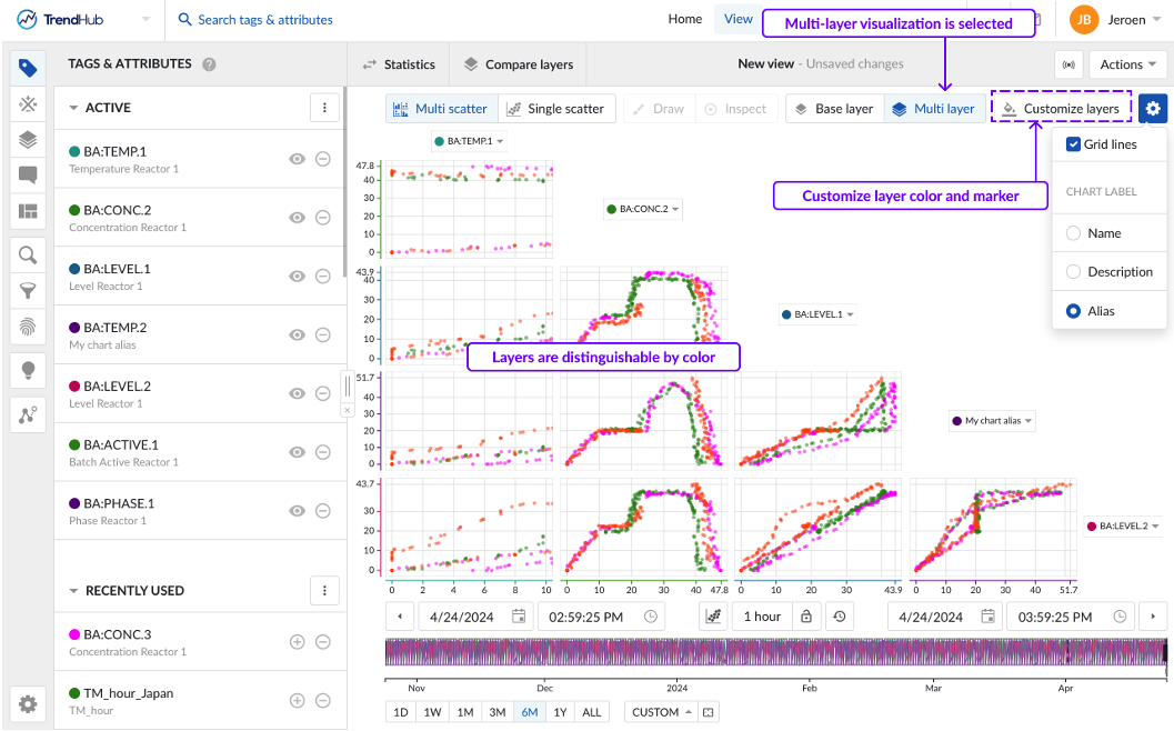
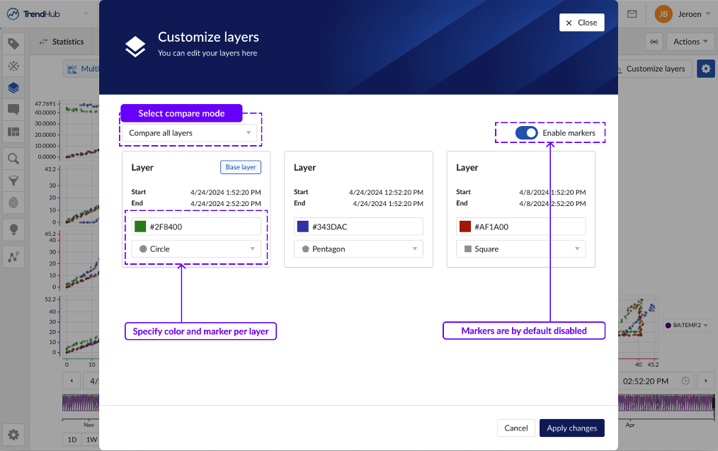
The “Customize layers” button opens a popup that allows you to define how all sublayers will be compared to the base layer.
Compare all layers: Assigns a unique color to each layer.
Base vs. the rest: Uses one color for the base layer and another color for all other sublayers.
In addition to comparing all layers individually, you can also assign the same color to periods of the same category, such as ‘good’ or ‘bad’ behavior, enabling you to identify deviating patterns between these behaviors.
By default, all data points are visualized as circles. To enhance the visual distinction of layers, the 'Enable markers' toggle can be activated, which will assign a unique marker to each layer.
Parallel coordinates plot enhancements
In this version, the following improvements have been added to the parallel coordinates plot:
Changing the order of the axes
Reversing the direction of the axis
Color results based on calculations on digital/string tags
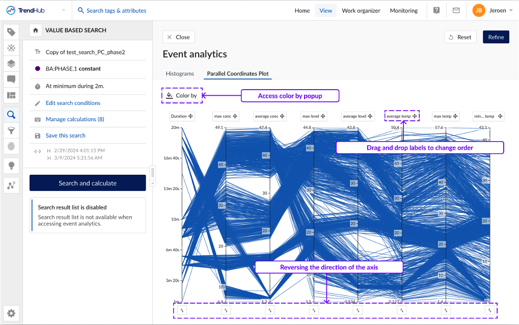
Clicking the 'Color by' button, will open a popup where you can select a configured calculation on a digital or string tag and the corresponding string values you want to distinguish by color. A unique color will be assigned to each selected value based on a predefined set of colors.
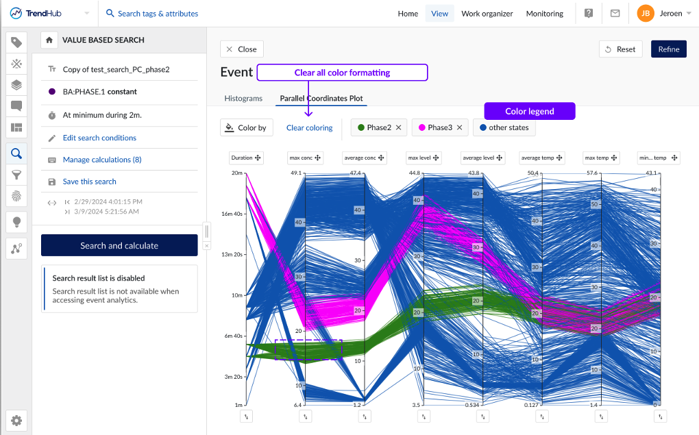
To enhance the readability of the chart, you can hover over the corresponding label in the legend, which will highlight the results on the parallel coordinates plot.
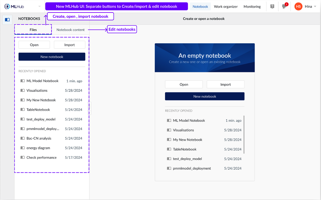
Improved Create, Import and Edit notebook UI
Users can now navigate across two separate flows; 'Files' to create, open or import a notebook and 'Notebook content' to edit a notebook and use code snippets. Previously, the code snippet component was displayed even though no notebook was opened.
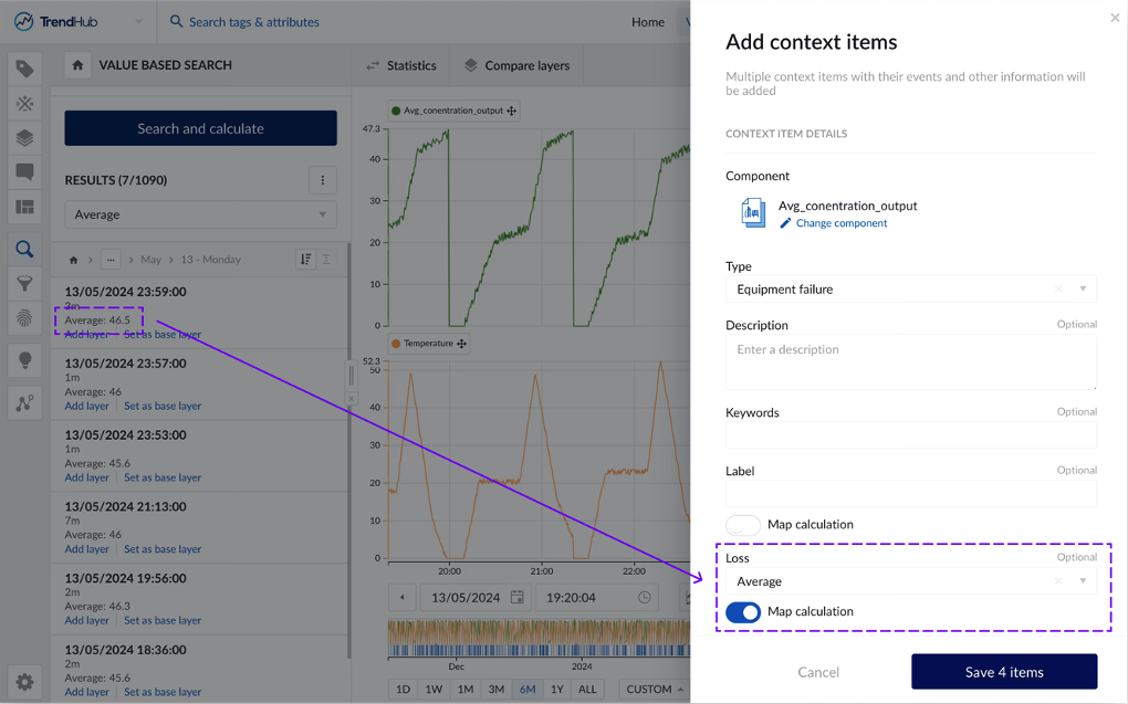
Write calculations on search results to context item fields
Users can now save values from calculations performed on search results to context item fields, ensuring persistence and democratization of valuable data within TrendMiner. The new feature enriches data contextualization capabilities, enabling deeper insights, more visualizations and analysis options within ContextHub, while also building a better integration between TrendHub and ContextHub.
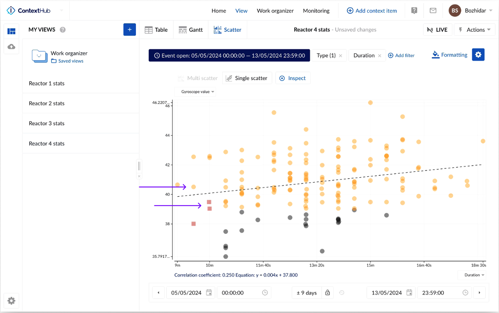
Scatterplot by ContextHub condition
Users are now able to change the color and shape of specific points on the context scatterplot based on predefined rules. By setting rules and conditions, you can visually distinguish data points that meet certain criteria, making it easier to identify patterns, outliers, and key insights at a glance. Whether you are highlighting data points within a certain range, marking significant events, or differentiating between categories, this enhanced visualization capability will enable more effective data interpretation and communication. This feature empowers you to create more informative and visually compelling scatterplots, enhancing your overall data analysis experience.
You can explore the new formatting feature for the scatter plot in ContextHub by clicking the formatting option in the top right corner, next to the chart settings button.
Extended Full Backup and Restore (As of 2024.R2.1)
To improve resilience and reduce recovery times, minimizing disruptions from system failures, we introduced a backup and restore solution that stores the full TrendMiner application data. You can choose between remote or local storage options for storing the backup data, providing an extra safeguard in case of local system failures.
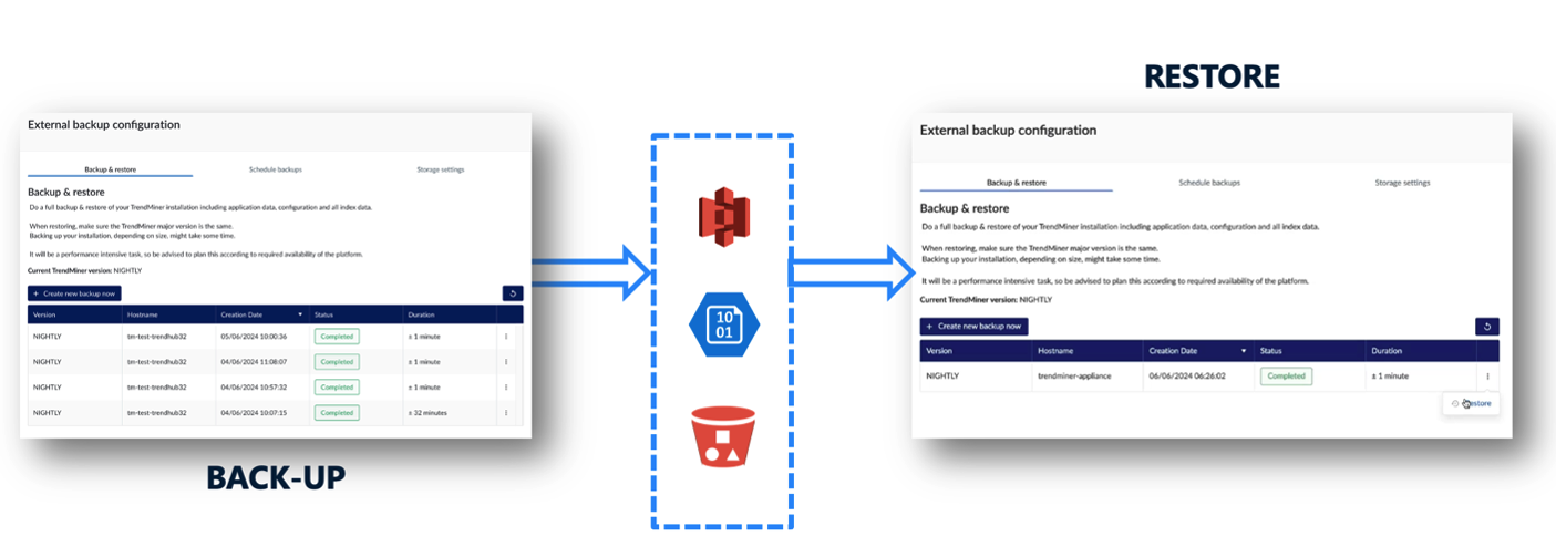
Additionally, our full backup option is recommended for migrating from CentOS to the new OS, AlmaLinux.
Full Application Back-up
Full Back-up: Captures all application and database data, including the index files.
Highly Self-Serviceable: Designed for ease of use and self-management.
Remote Back-up/Restore
Remote Storage Options: Supports AWS S3 and Azure Blob storage.
Requirements:
Requires an AWS S3 or Azure Blob storage account.
Local/Custom S3 Back-up/Restore
Storage Options: Supports local or remote storage on S3 storage providers.
Requirements:
Requires setup of S3 storage.
S3 storage provider must be compatible with AWS S3 API (v4).
Suggested local S3 provider: Min.IO